I’m fan of Solarized palette so I wanted to find way how to get it to Console2 which I was made to use at my working PC. There is just 16 basic colours in Solarized palette so it should be easy to use them in console. The problem started the moment when I realised there is no obvious mapping between base terminal colours and Solarized palette. Most of the examples is for source code editors as Vim and specific language which pretty controlled environment. We know what combinations of colours are used so we can build the theme. If we want to bring it to console where each different application or command can do whatever mixture of colours they want, we have much harder work.
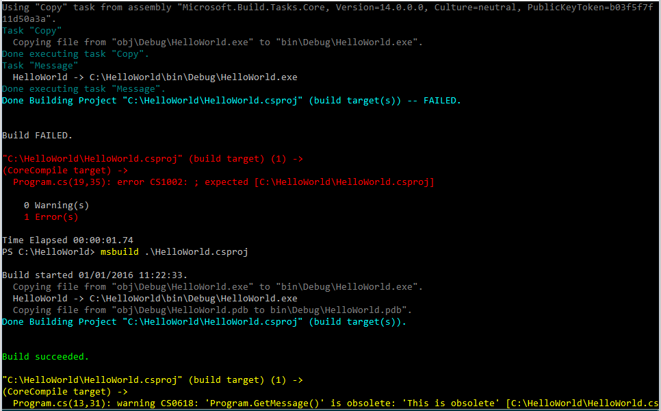
I’m .NET developer, so my main use-case is readable msbuild output, but the target is to have any coloured output as close as possible to base terminal colours (or at least to maintain readability).
Just for reference this is how the base terminal colours look (not actual msbuild output, just compilation of different msbuild output lines to see all the possible used colour combinations):
And one more for Powershell fans, the default theme used by it:

So I went to the google to search for few options and I found couple of Console 2 themse on GitHub but none particularly compelling. They either contained errors or were not readable much due to bad combination of colours.
Then I discovered that Conemu uses Solarized palette in one of its themes, it is nicely readable and pretty close to base terminal colours. I created version of it for Console 2 and put it to GitHub for everybody interested:

After comparing it to Solarized palette used in some applications I realised that although it maps base terminal colours to Solarized colours as closely as possible, there is problem with using background and content colours. Most of the terminals uses colour 7 as default content colour. The Conemu uses actually background colour in its place. So although it is perfectly readable the contrast is not in accordance to original Solarized idea. After bit of experimenting I created one more version which I put to GitHub as well and I try to use it for some time. Maybe somebody finds it even more useful:
I tried to use the background and base content colours which Solarized suggests (colours at index 7 and 15). I had to move the two brightest colours somewhere, so I decided to put them on index 2 and 3 which are not often used and if they will be used it will still be readable. In my case of msbuild, I had bad luck because colour 4 is used but most of the console usage should be fine.
